Project Overview
Timeline
This project was created by the Summer 2024 Siegel+Gale New York Intern Class over the span of the internship (June 3, 2024 - August 10, 2024)
Background
Carousel is a project where I along with a team of 12 defined, designed and activated a new parent brand for a spun off ice cream powerhouse. I lead the development of the parent company's brand strategy along with designing of a digital touchpoint and physical activation to bring this product to life.
Define, design and activate a new parent brand for this spun off ice cream powerhouse. Develop the parent company's brand strategy, design a new visual identity, create a product extension, and tell an ingredient brand story across all products.
Whats Going On Here?
Where It Started
Unilever has controlled the ice cream industry for the past 20 years. It acquired 5 of the 10 best-selling ice cream brands in the world, hoping to take control of the industry. Little did they know, it wouldn’t be easy.
Where It's Going
Unilever has decided to spin-off it's ice cream division because it was bringing down their overall profits. The board wants Unilever to focus on its other portfolio brands and believes that ice cream will be better delivered under a different structure. This newly spun off frozen treats brand now needs a new parent brand and identity.
Research | Exploring Our Audience
During our research we surveyed a total of 182 people where we were able to get 3 main opportunities for SpinCo before we delved into our strategy and designing the Re-brand. To start the survey we first defined our goals through research objectives.
The Survey
With these objectives defined we were able to create survey that would get a view on the landscape of ice-cream consumption. We decided on the format of survey due to it being something that could be easily done in a short amount of time with a large amount of people.
Mode and Timing
A ~15 minute survey online survey conducted June 2024 taken by 182 people
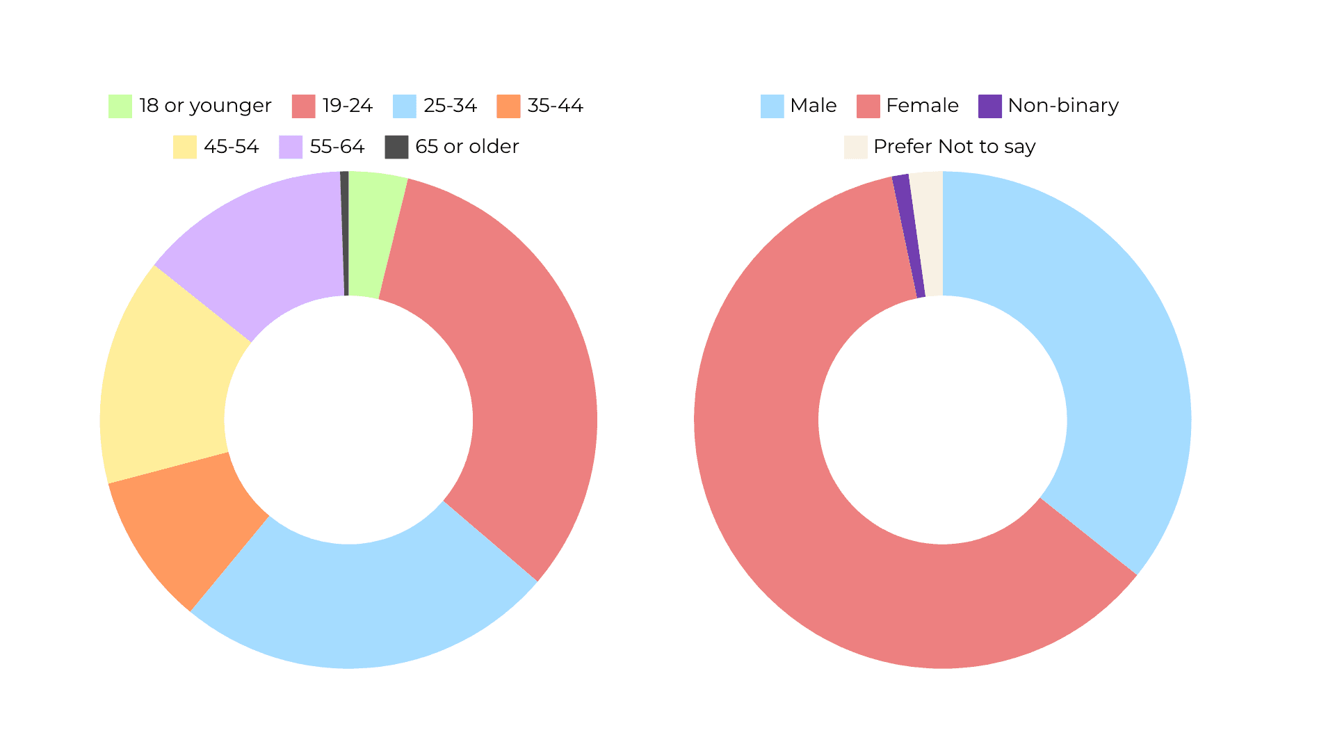
Once created we were able to send it out and we got a variety of statistic regarding demographics, our overall performance in the market, and what we were known for.
Demographics
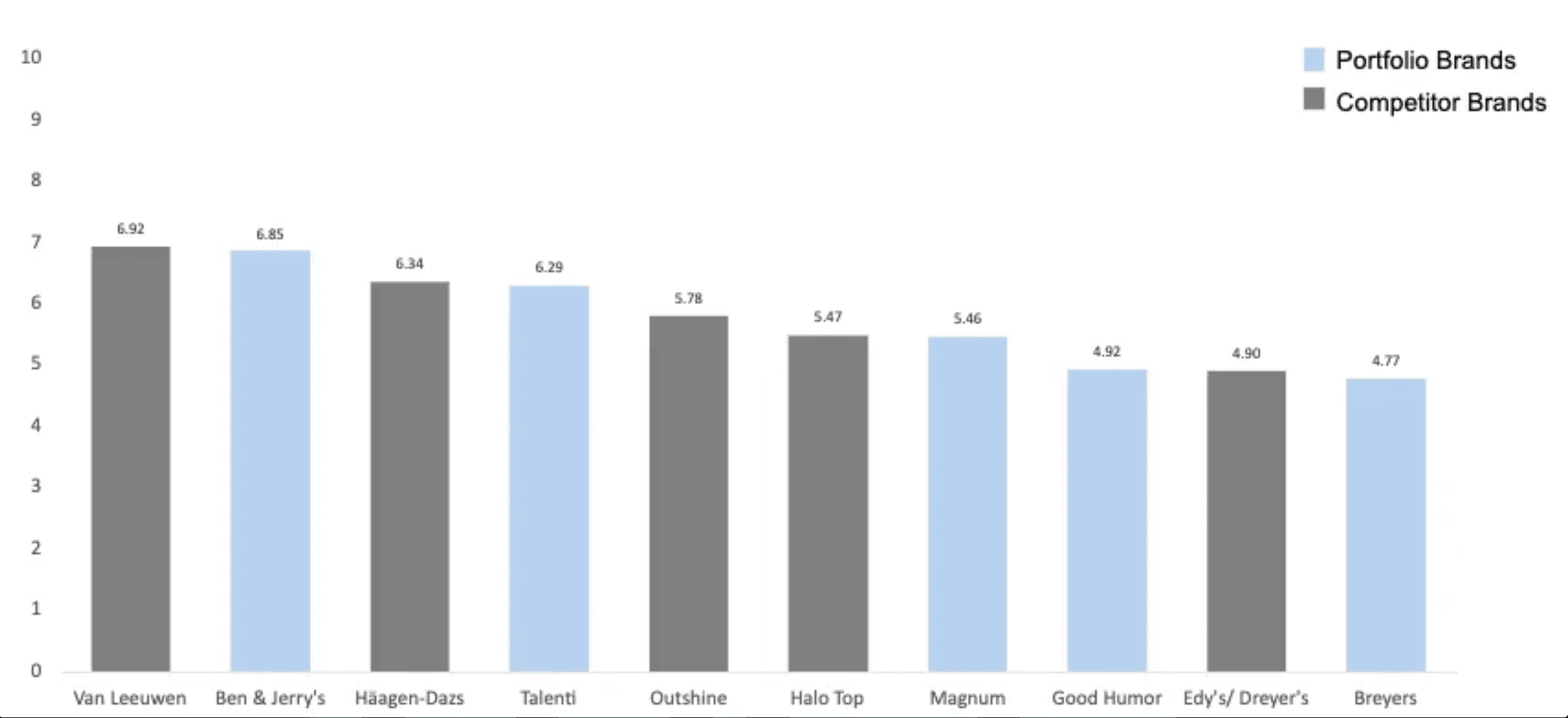
Our Overall Performance
In this portion of the survey we can see that our brands (shown in blue) are just as well known if not more than our competitors (shown in grey)
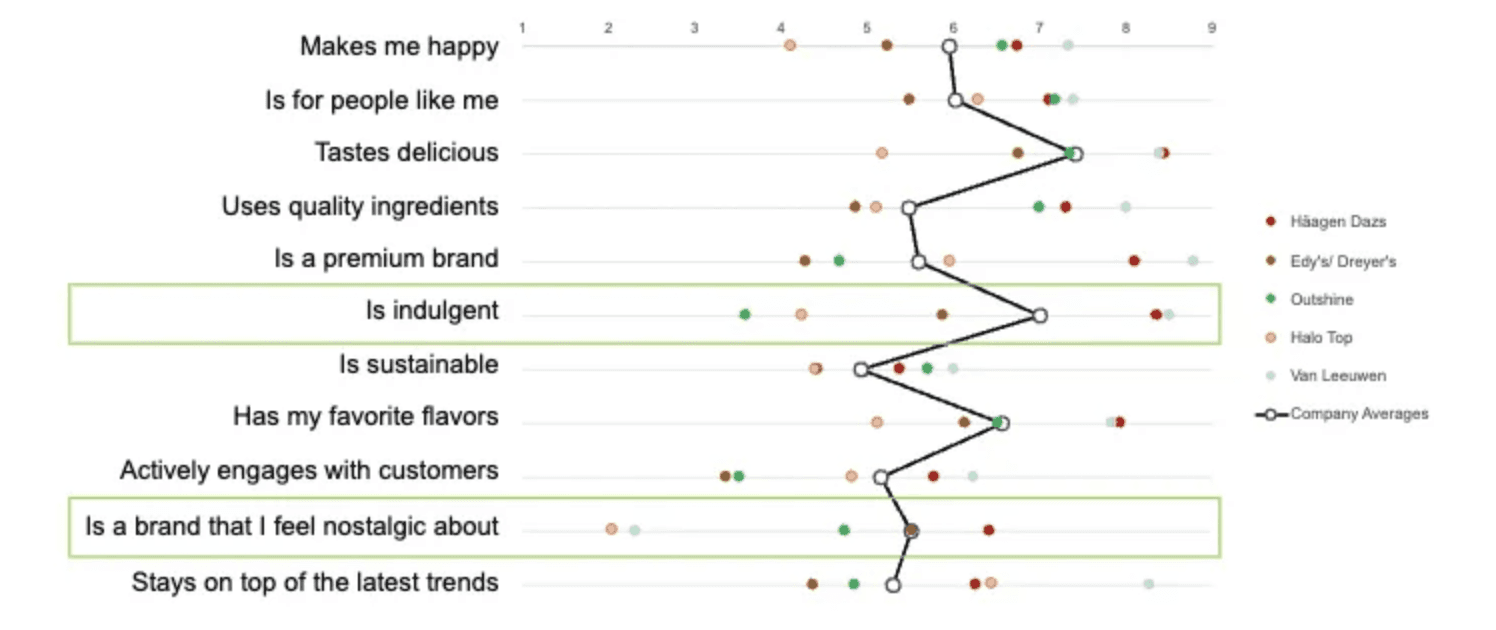
What We Are Known For
This important information brought us to our key design opportunities that became our source of truth for all members of our team when it came to their respected portions.
From our research survey we mainly realized that people associate nostalgia with togetherness
💬 Ice cream is a vehicle of togetherness but right now people aren't together and as the world grows more disconnected, people are increasingly craving connection.
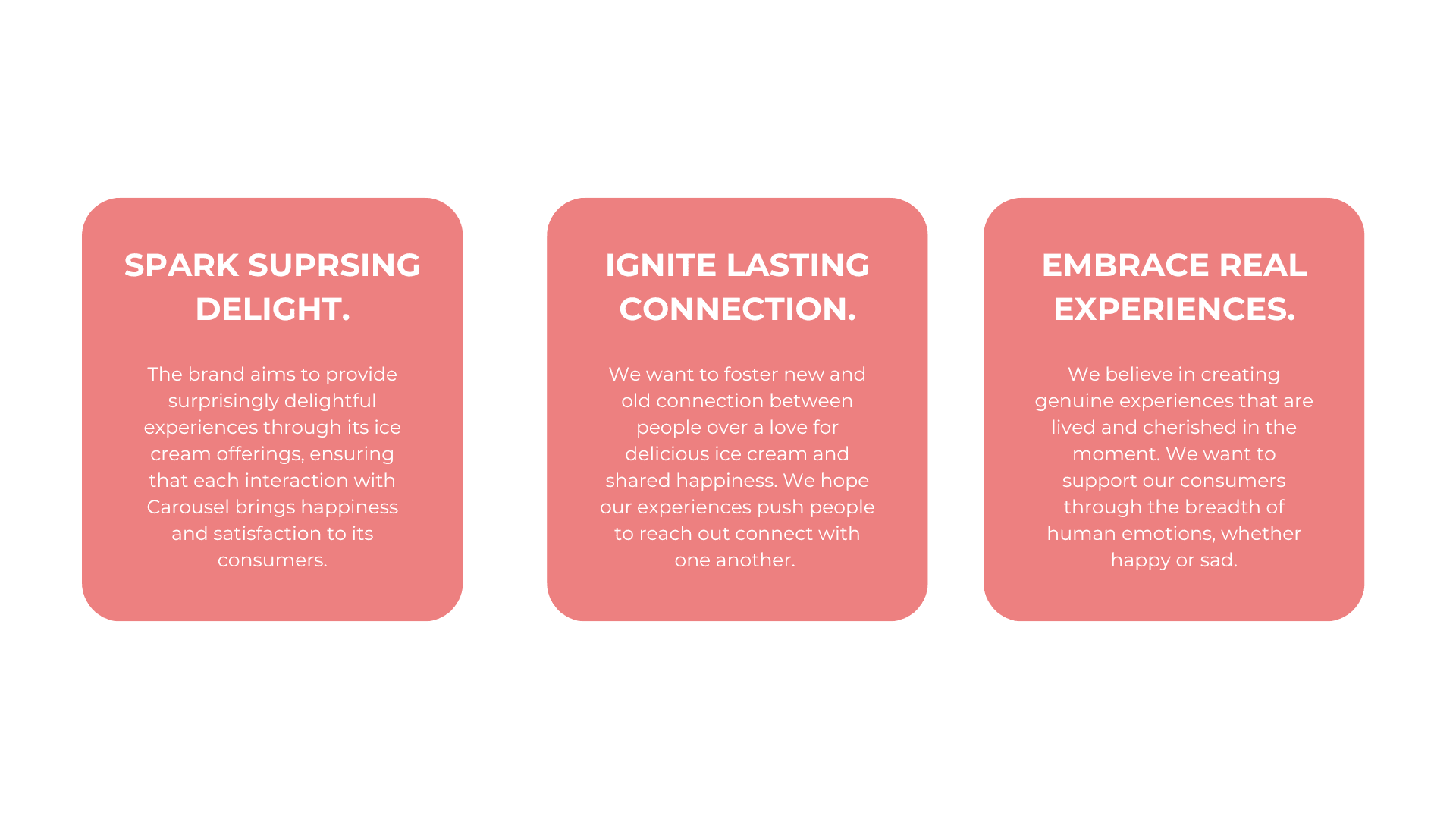
Experience Principles
Once this strategy was defined I was able to outline very clear experience principles to how our brand would feel and interact with it's audience. These 3 experience principles led my design for the website and physical activation part of this project and was so important to the work I created.
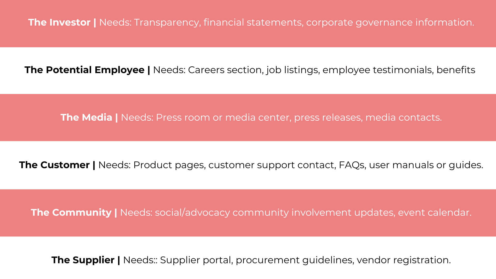
With the research complete, the strategy set and the design foundation in place, it was finally time to breathe life into the experience portion of our brand. . I began by stepping into the shoes of my audience—asking myself, Who are they? What do they need? What do they hope to feel when interacting with this site? Answering these questions allowed me to build a clear picture of my users and their goals.
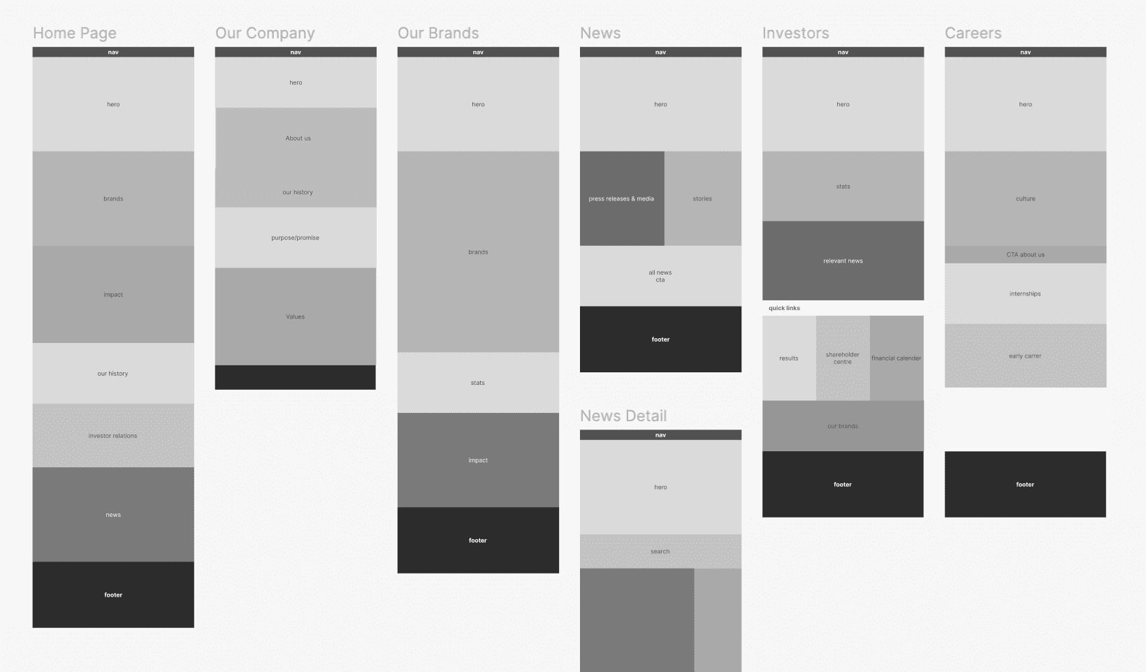
With the audience defined I then was able to make a clear site map. This allowed me to have a clear plan and hierchy of the site I was going to creat before wireframing and allowed me to carefully think through the user journey and their needs.
As a supplemental guide before starting mid-fi I also turned this site map into blockwires to create a even clearer vision of the site I was creating
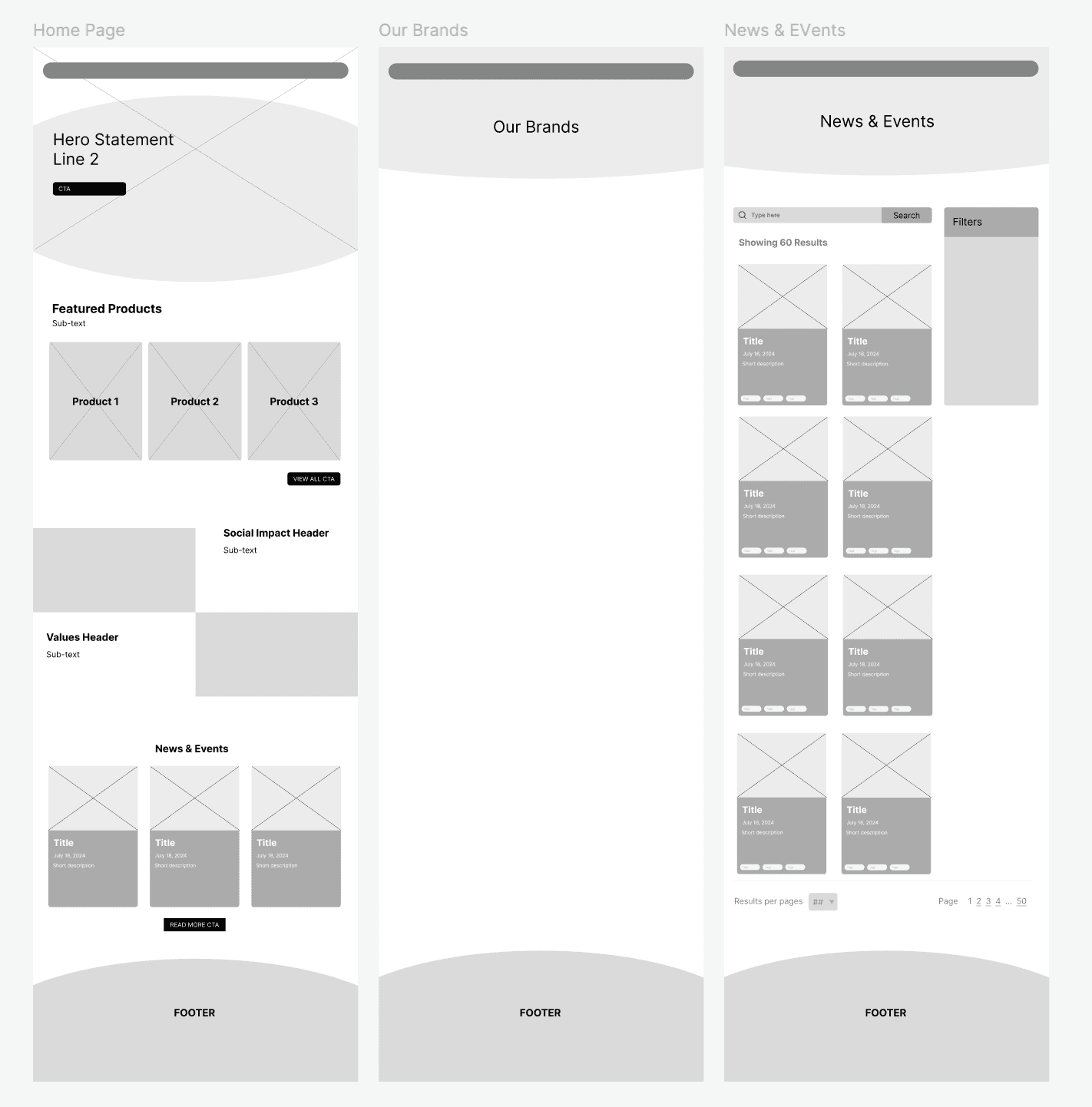
With the blockwires and site map complete, the foundation of the design was solidified. Now, it was time to bring the structure to life by creating mid-fidelity wireframes. This stage was crucial for refining the visual layout and interaction flow, transforming abstract ideas into tangible screens. Each element was placed with intention, ensuring clarity, usability, and alignment with the audience's needs.
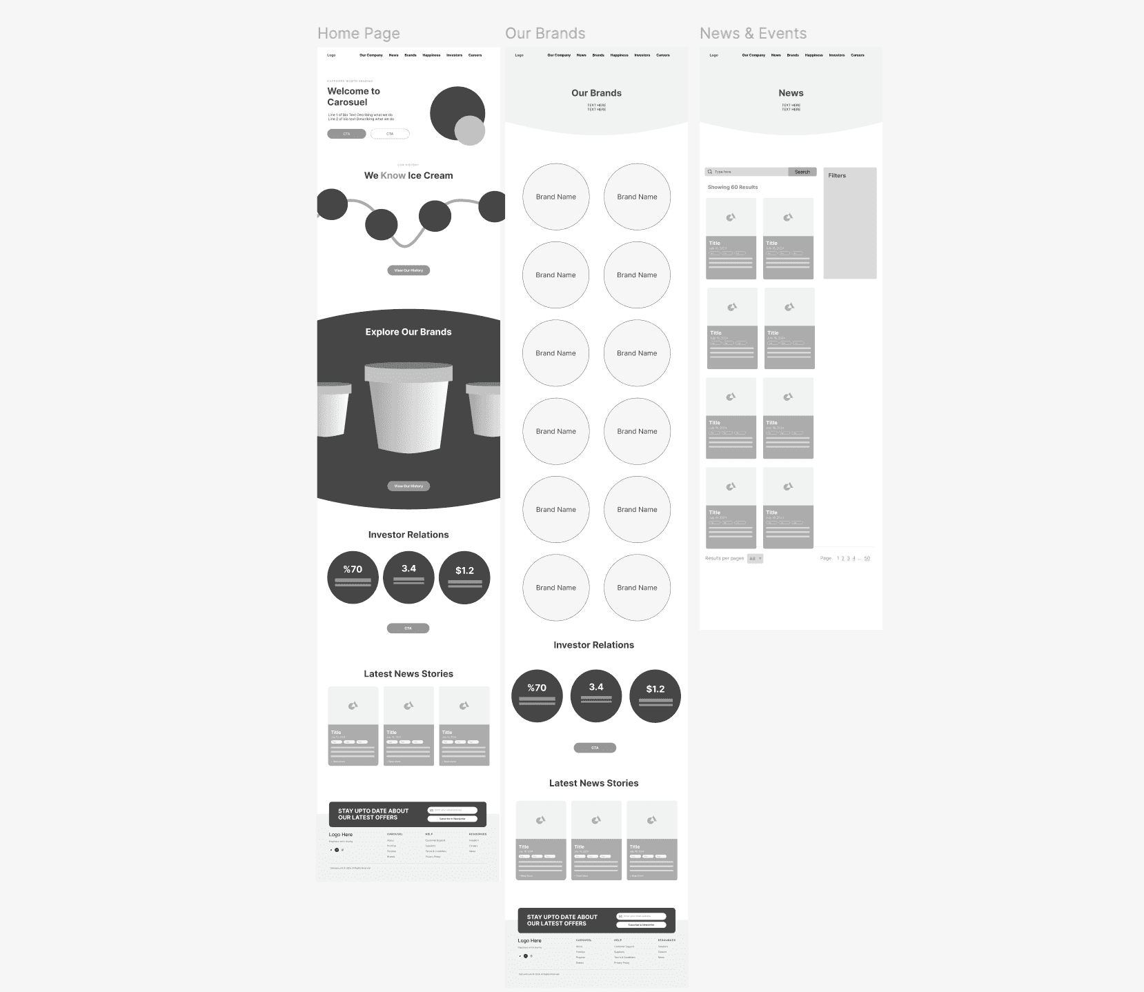
After getting a rough structure I was able to get feedback from the visual design team and my manager for some key point improvements:
Adding more unstructured elements
More interaction to spark surprising delight (experience principle)
Playful text to be authentic to the brand
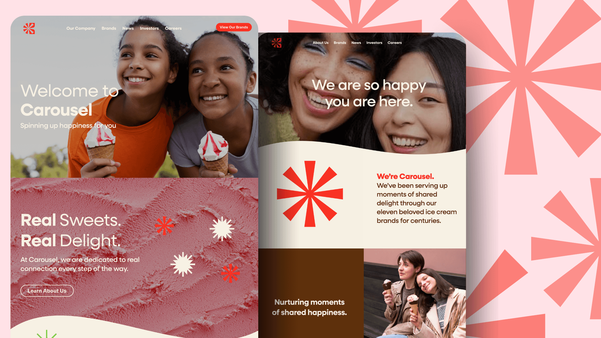
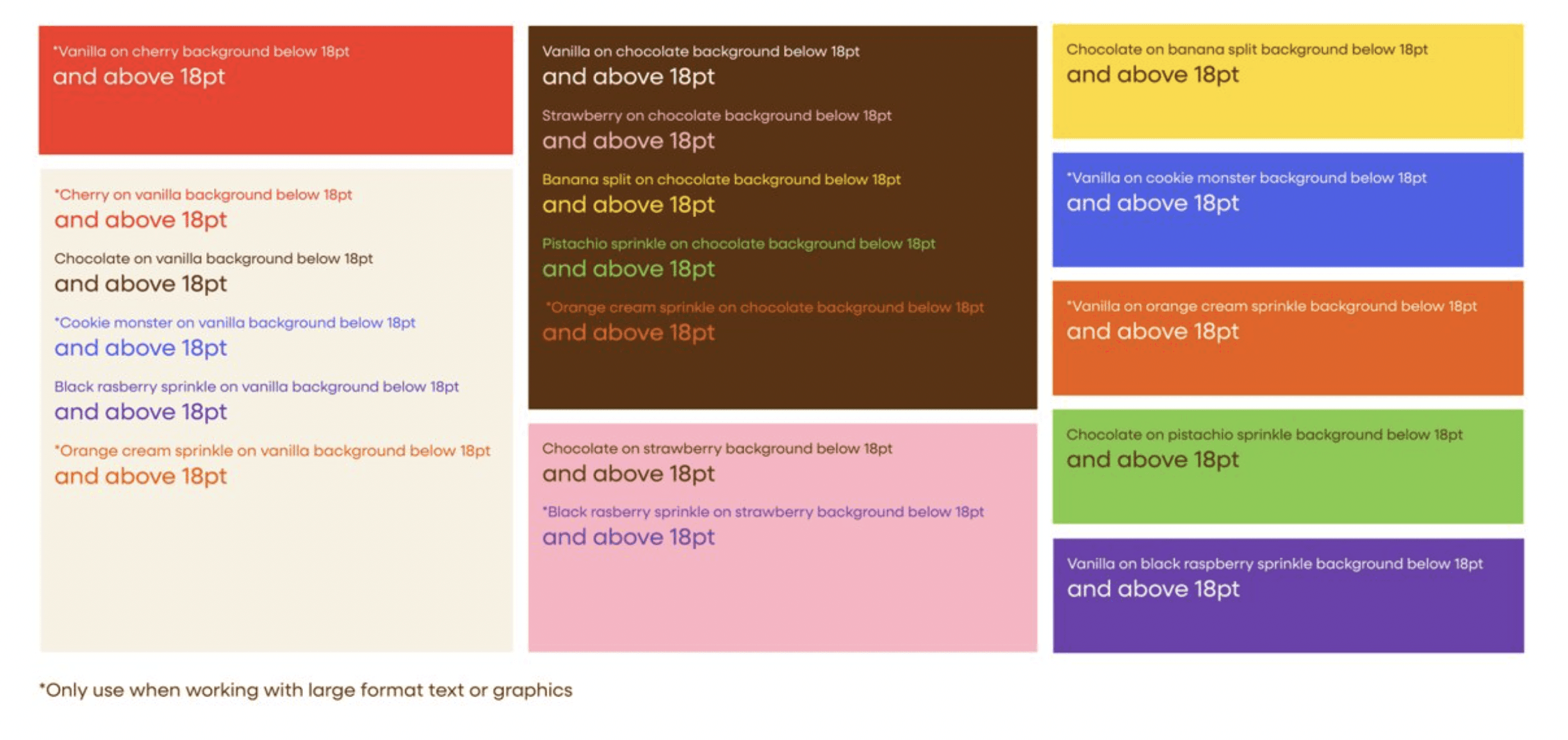
After applying this feedback I was able to move into the final ptotype. In this stage I got help from the design team who worked with me to create a color scheme for the new brand, named Carousel, and check for ADA compliance within the site and the visual design
With this I was able to create a colorful site that was well aligned with the entire teams vision for our brand.
I’m incredibly proud of the journey this project has gone through—from initial ideas to a fully realized product. Seeing how each step in the process built upon the last, and how every challenge ultimately pushed the design to be better, has been a rewarding experience.
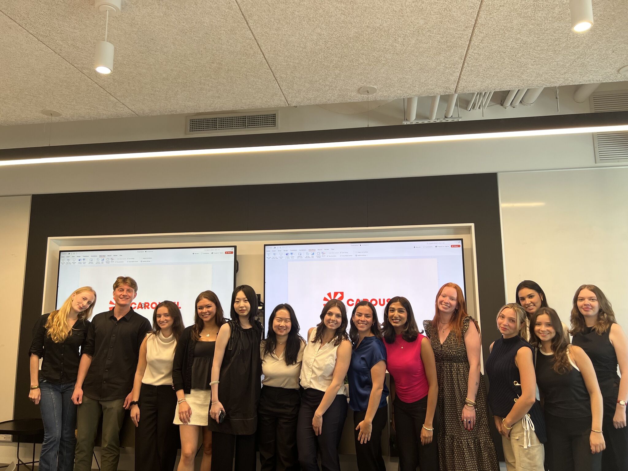
Here is a picture of the amazing team of interns I worked with to make this project possible! This was such a team effort and working with this class was such a fun experience where I learned so so much!
After our presentation, Howard Belk, the CEO of Siegel+Gale, expressed his admiration by saying this was one of the most well-thought-out projects he had seen and that he was incredibly impressed with our work.
This project was an incredible opportunity to witness the design process on a larger scale than I had ever experienced before. Collaborating with a big team, each member contributing unique perspectives and expertise, was both exciting and challenging. Navigating so many moving parts required adaptability, strong communication, and a deep commitment to the shared vision. Along the way, I gained invaluable insights into teamwork, problem-solving, and the importance of staying user-focused in the face of complexity. Here are my three main takeaways:
